An established Middle Eastern food and bakery brand, refined and carried across its touchpoints. Then extended into a warmer, faster Bakery chapter.
Two chaptersANAT was already a name people knew. We refined its identity, then carried it through everything a customer touches: menus, in-store posters, packaging, vehicles and social.
ANAT Bakery is a spin-off of that identity. It keeps the wordmark and the house reds, then brings in orange, yellow and loose brushwork for its retail and trade work. We show both chapters here because one grew out of the other.
- Client
- ANAT
- Sector
- Middle Eastern food & bakery
- Chapter 01
- Identity refinement, colour, typography, photography direction, menus, in-store posters, packaging, vehicle branding, social
- Chapter 02
- Bakery logo, palette, brushwork and illustration, trade brochure, packaging, exhibition stand, vehicles, outdoor
Chapter 01
ANAT, the core brand
Refined, not replaced.
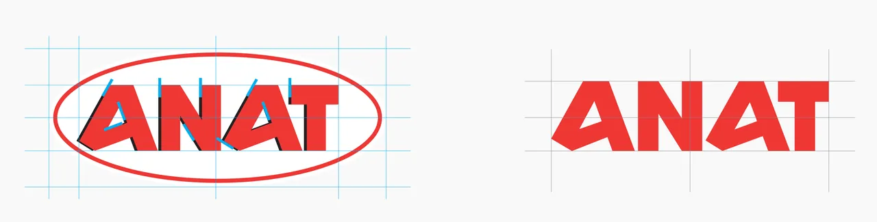
We started from the mark ANAT already had: the wordmark inside an oval, with an offset shadow. We kept the angular letterforms and took away the oval and the shadow, so the wordmark carries the brand on its own and holds up at any size, from a menu fold to the side of a van.
A richer house red.
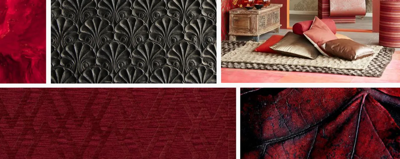
We moved ANAT from a bright primary red to a deeper Pantone, chosen to give the brand a more Middle Eastern feel. The reference board drew on velvet, brass, embroidered textiles and spice. Every application on this page sits on that one red.
Pantone 194 CC0 M100 Y64 K33R170 G10 B47
Two weights, one voice.
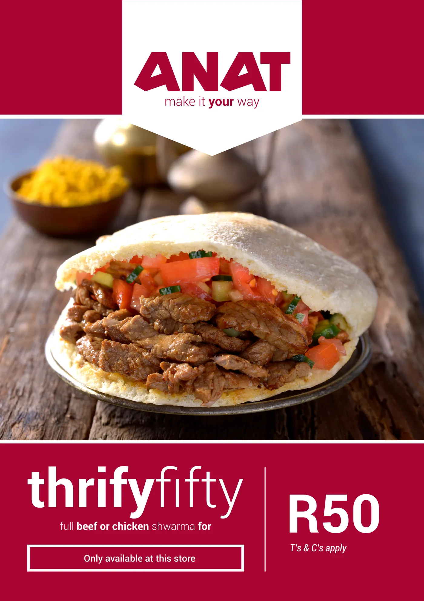
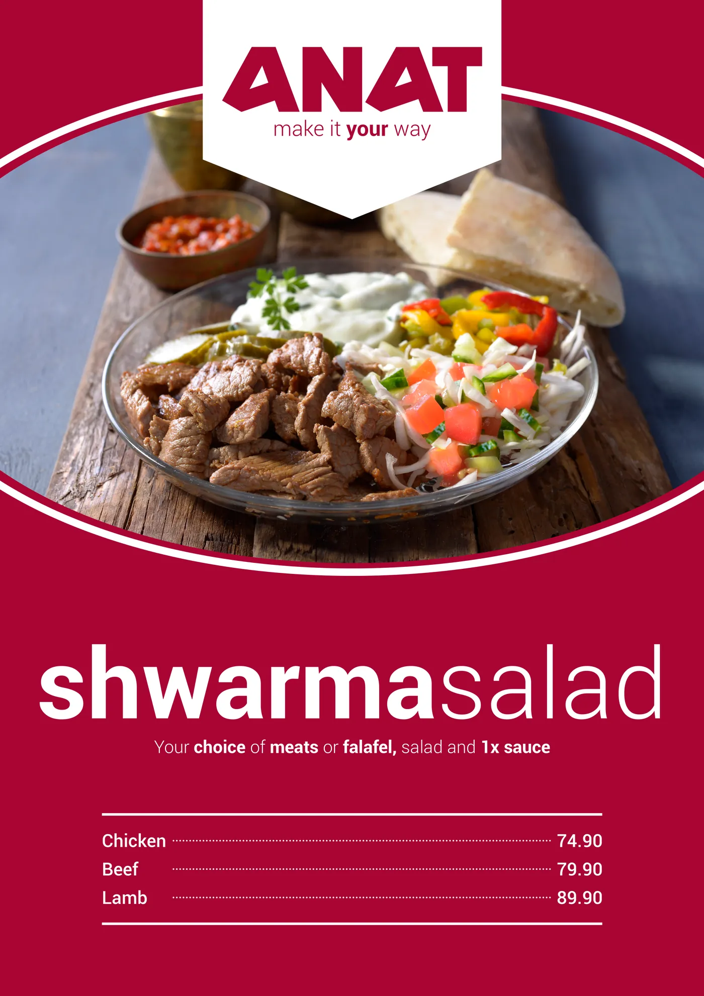
Roboto carries the brand in two weights. The tagline sets Light against Bold, and the in-store posters repeat that move for product names, joining a bold word to a light one with no space between them.
make it your way
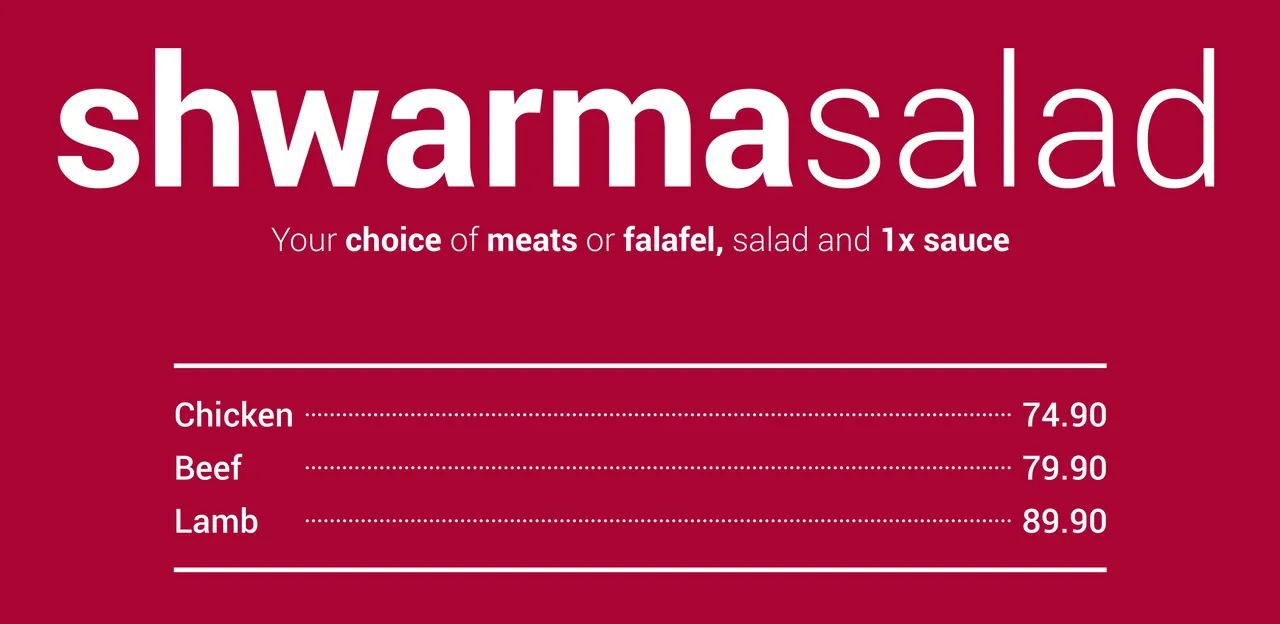
Authentic, detailed, close.
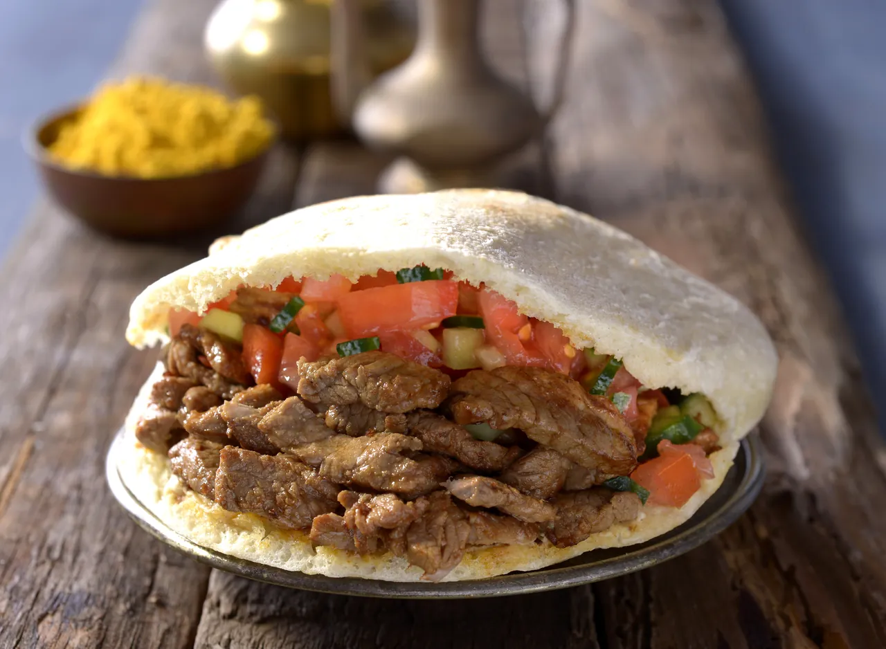
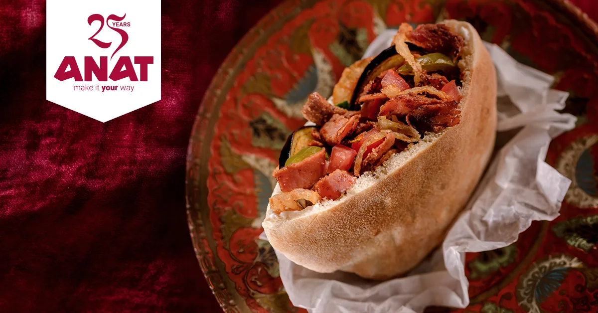
The photography direction in the guide comes down to five words: authentic, Middle Eastern, cultural, unique and detailed. In practice that means worn timber, brass, linen and spice, shot close enough to see the char on the meat and the oil pooling in the hummus.
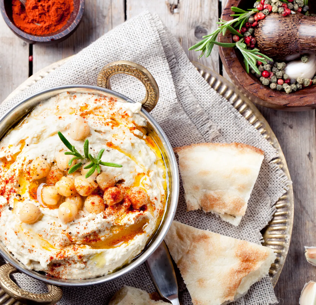
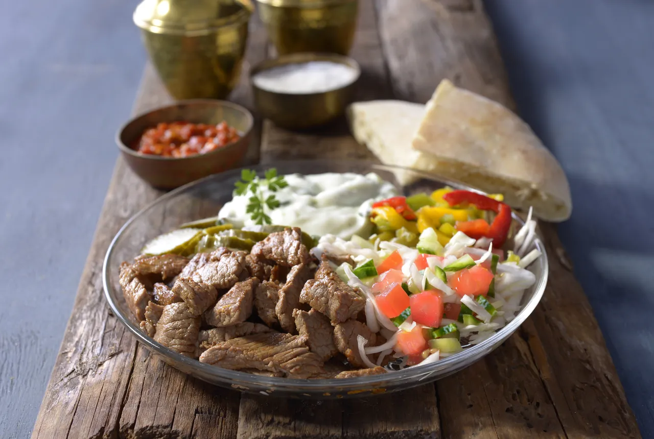
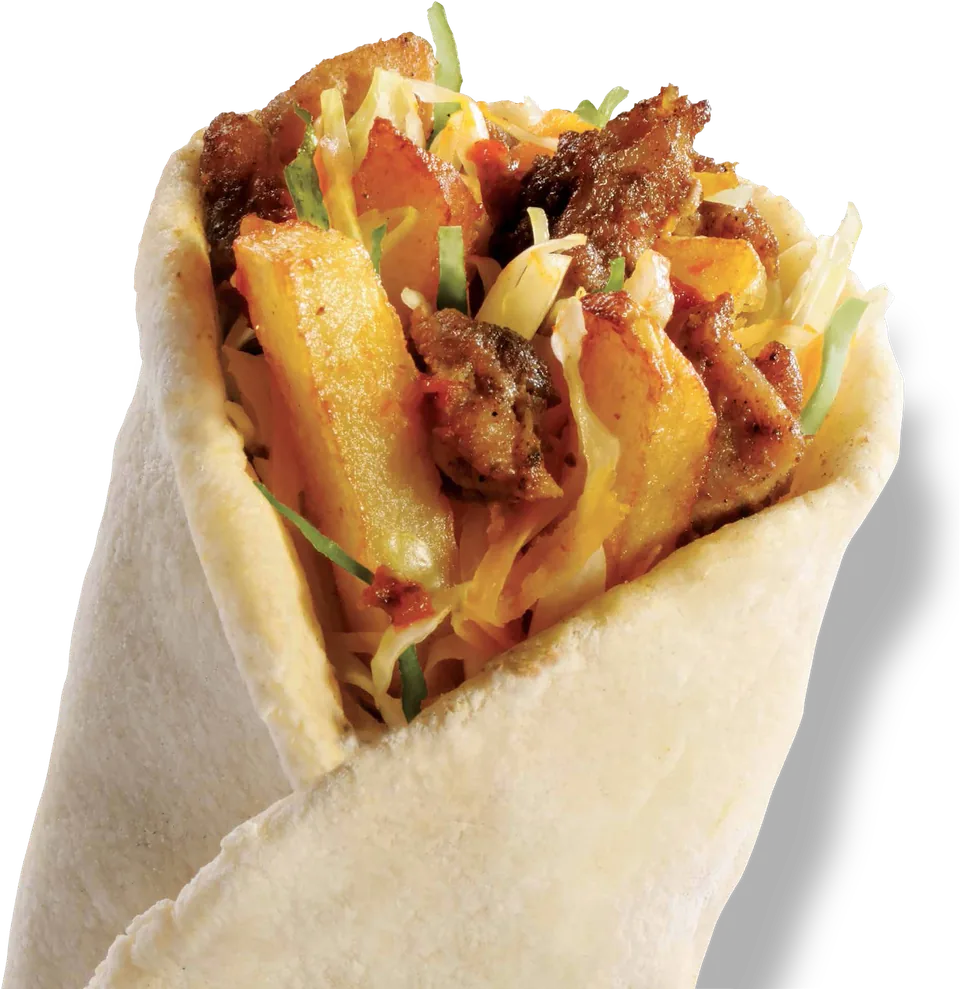
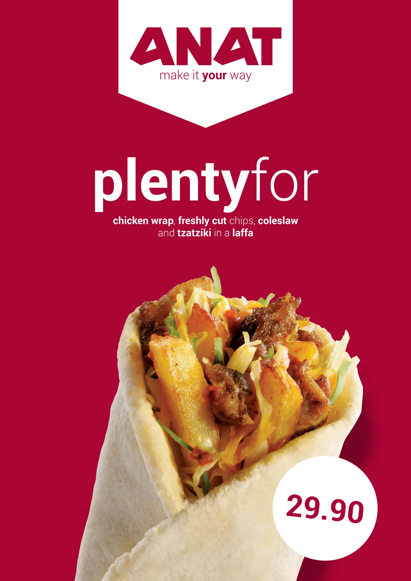
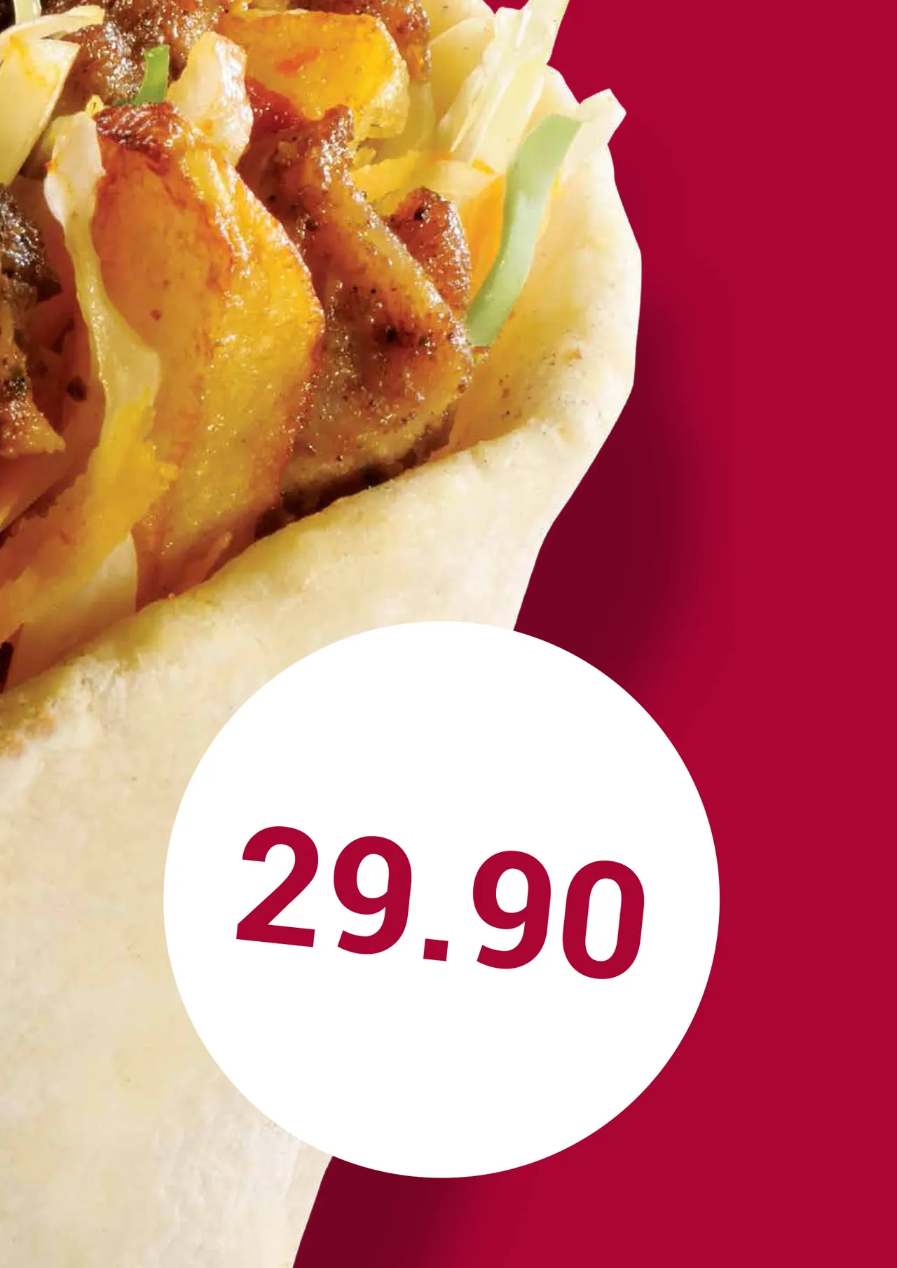
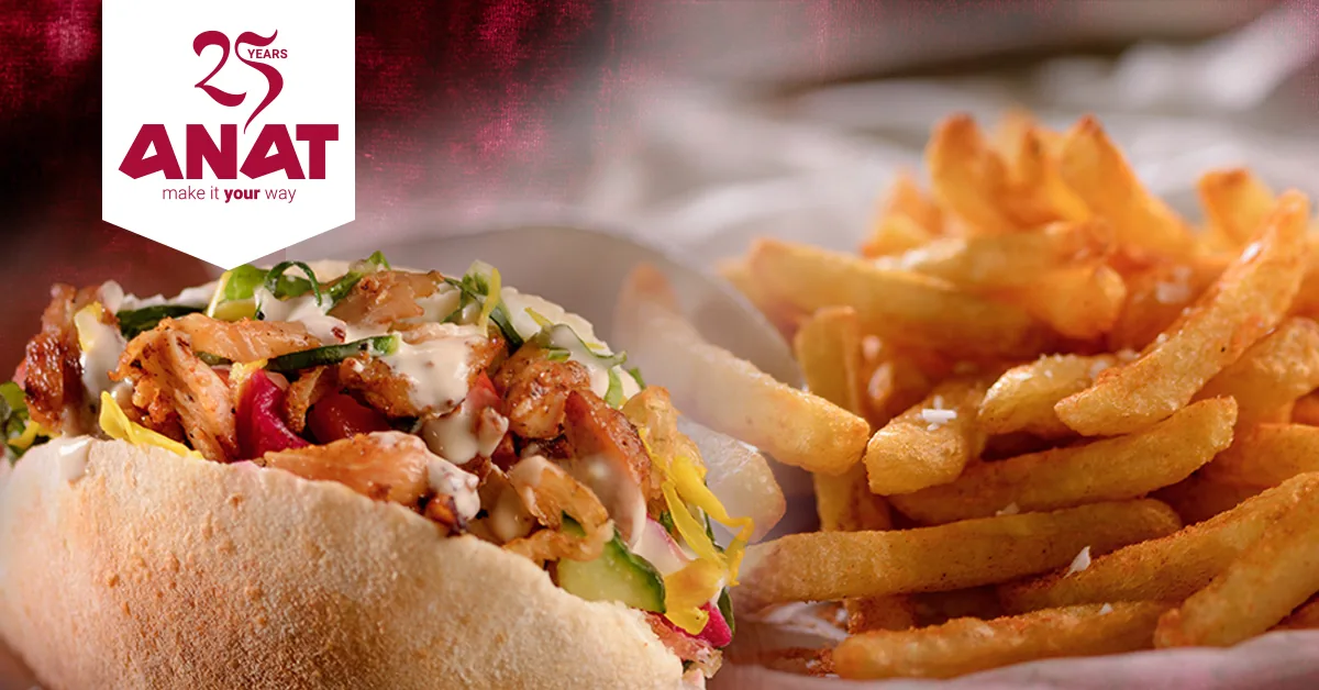
Photography from the in-store poster series. The wrap is the cut-out used on the plentyfor poster.
In people's hands
Posters, menus, packaging.
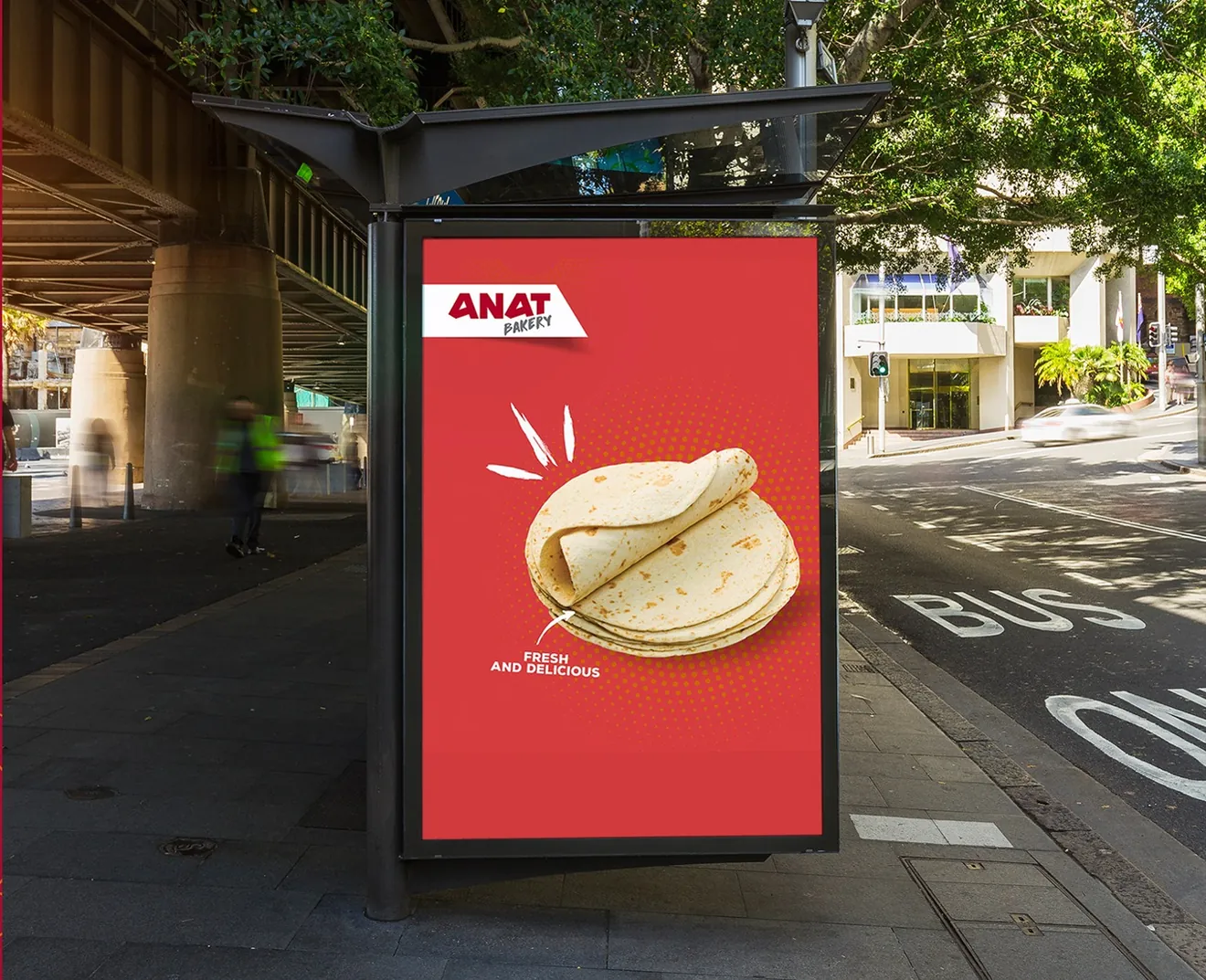
A white pennant carries the logo at the top of each A1 poster, the same device that frames the social posts. Prices sit in a white roundel or a dotted list, so the offer reads from across the store.
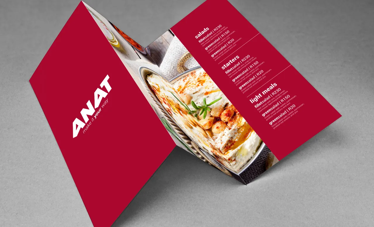
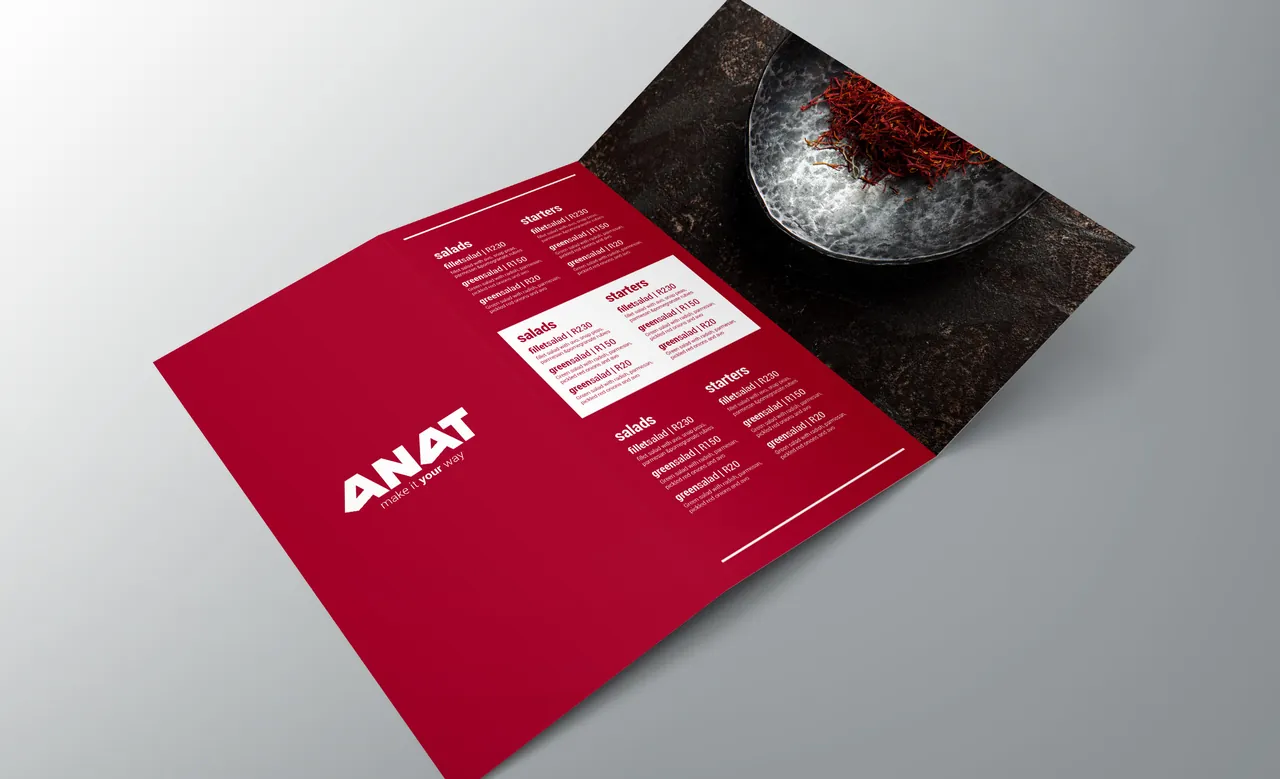
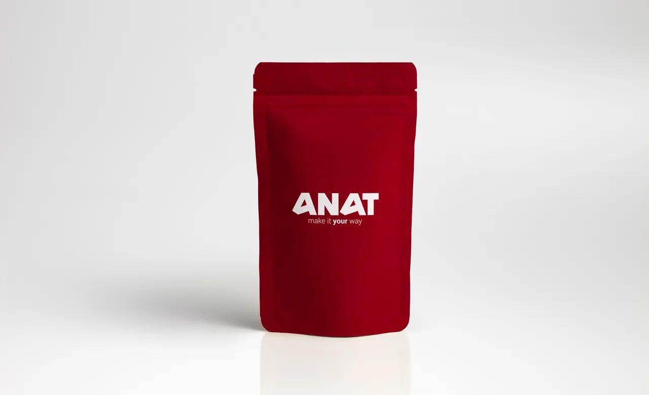
Two menu options, a z-fold and a gatefold, and a stand-up pouch, all presented in the guide as options. Each puts the house red outside and the food inside. The pouch is taken further in a concept near the end of this page.
On the feed
One red ground, every occasion.
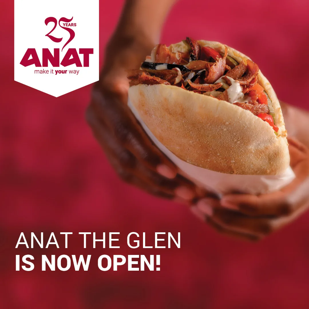
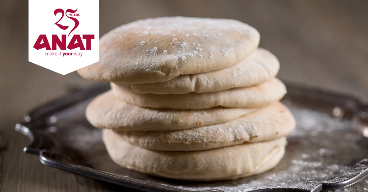
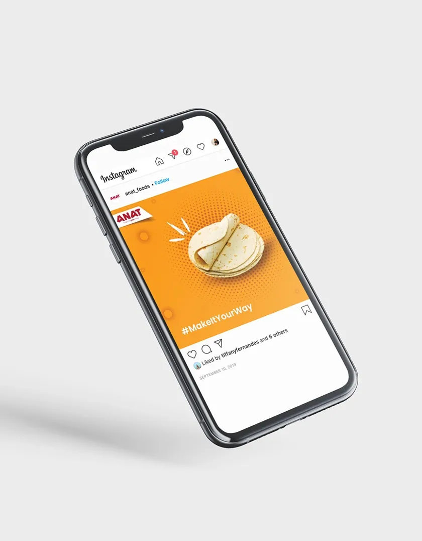
Store openings, promotions and brand messages share one structure: the pennant top left, a photograph or a soft red field, and Roboto in two weights. On social, the pennant also carries a 25 Years mark.
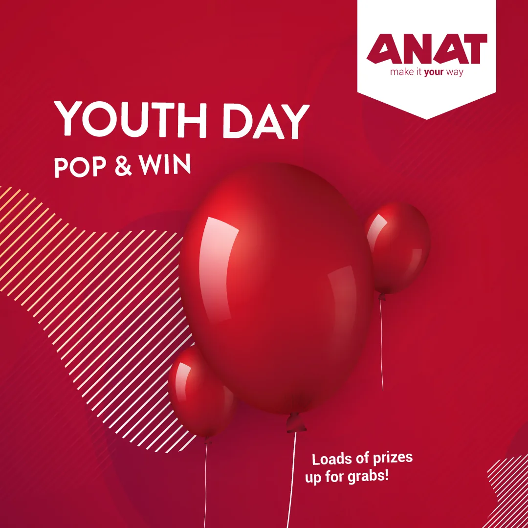
One device, everywhere
One white flag.
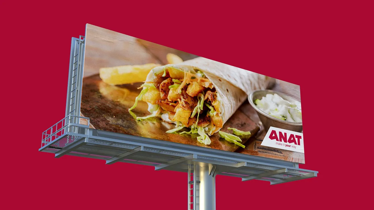
The white pennant hangs the logo over the food. It is the most portable part of the system: the same flag tops the posters and every social post, carries the 25 Years mark when it needs to, and turns into an angled tag on the billboard.
A1 poster 
Social · 25 Years 
Social · seasonal 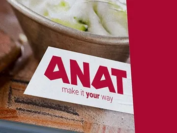
Outdoor · billboard tag
Pantone 194 C
Same family.
Warmer tempo.
Scroll through the ANAT Bakery palette, from the house red to Pantone 1495 C.
Chapter 02
ANAT Bakery
Anat Bakery logo is a spin off of the original and express logos and emanates the feeling of speed, for when a quick, make it at home meal is what you need.
From the ANAT Bakery brand boards
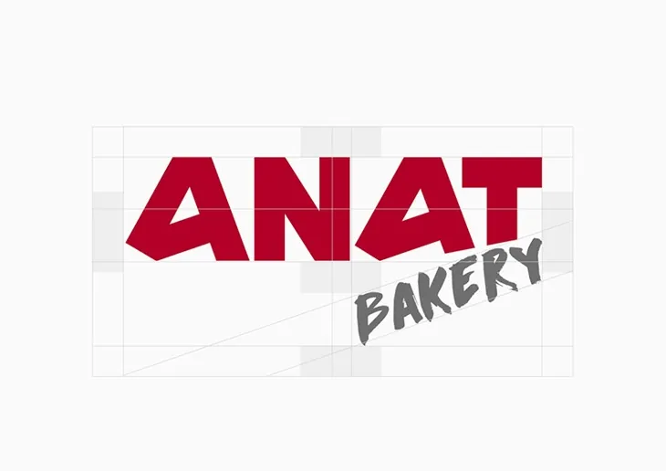
The wordmark stays exactly as it is. BAKERY is written underneath in a brushed hand, tilted up under the T, which gives the mark its forward lean. The palette keeps the ANAT reds and adds four warm steps through to orange.
- Pantone 194 C
- Pantone 200 C
- Pantone 179 C
- Pantone 1645 C
- Pantone 159 C
- Pantone 1495 C






















Loose hands on a tight system.
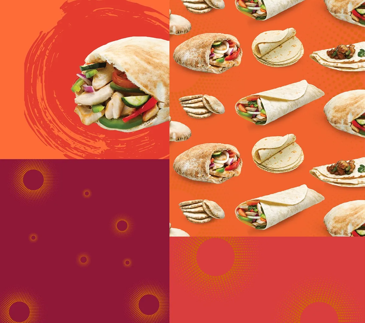
Brush strokes, crosses, dotted clusters and sun-rays give the Bakery its energy. Each mark above is lifted from the original artwork and drawn in sequence. Around them, the pattern system repeats product photography on orange, scatters halftone suns across burgundy and wraps a pitta in a brushed circle.
For retail and trade
From the brochure to the stand.
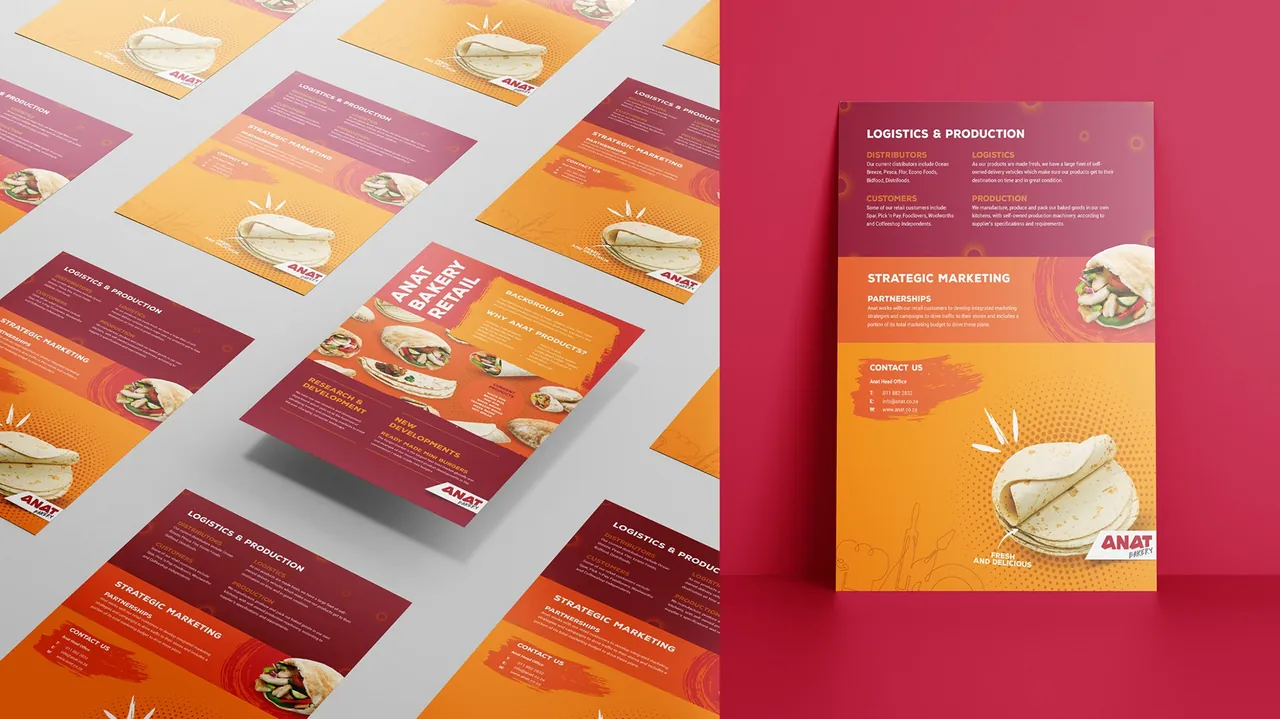
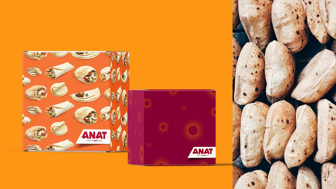
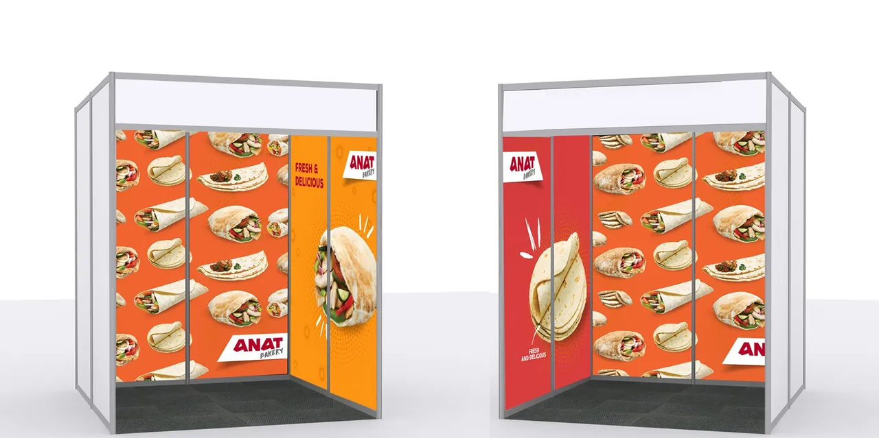
Much of the Bakery work speaks to retailers and distributors. The trade brochure stacks logistics, production and marketing in burgundy, orange and yellow bands, set off with brushed circles and halftone suns. The same orange repeat wraps the boxes and the exhibition stand.
Across touchpoints
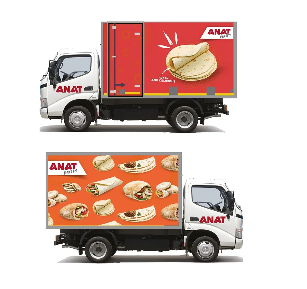
On the road and on the street.
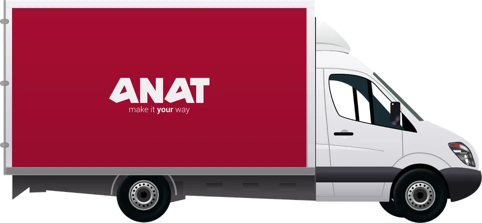
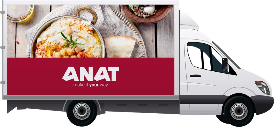
Side by side, the two fleets show how far the system stretches. The ANAT vans are quiet: the house red, and at most a single photograph. The Bakery trucks bring in the orange product repeat and the brushed wrap. The wordmark doesn't change.
Chapter 01 · ANAT
Chapter 02 · ANAT Bakery
IDÉE concept · not a produced ANAT product
Make it your way, at home.
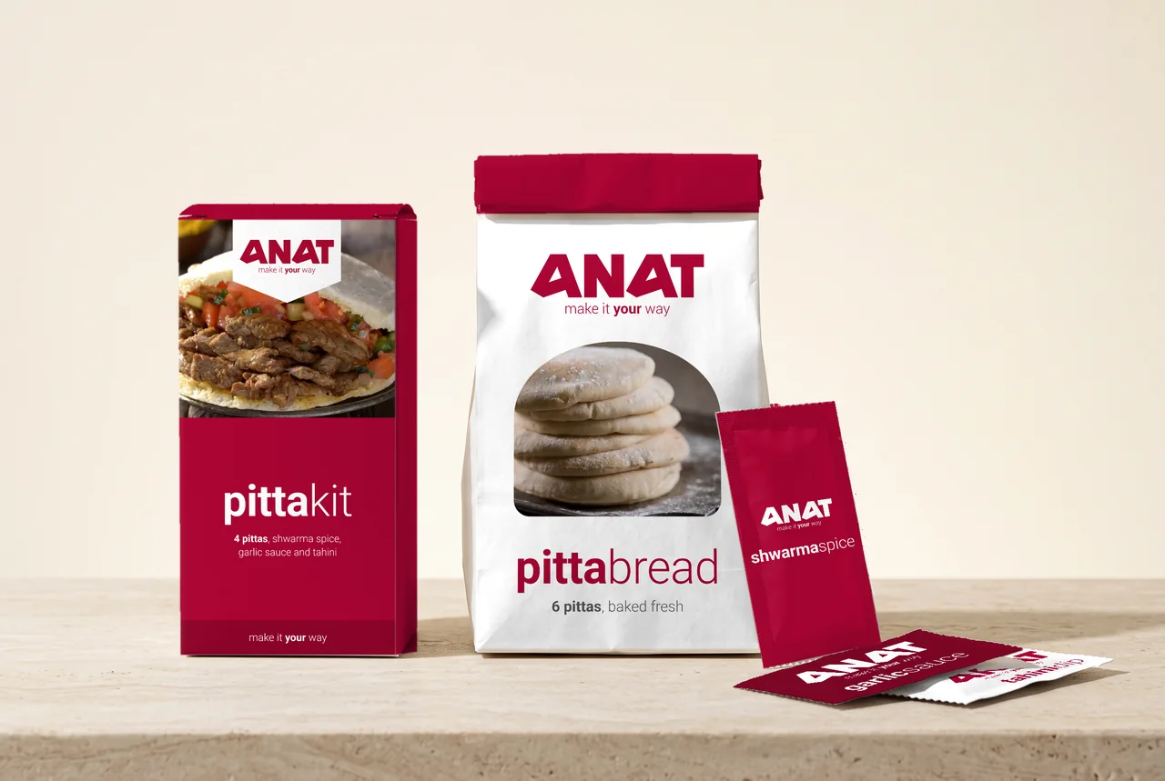
The original guide only went as far as a plain stand-up pouch. ANAT's tagline already invites people to build their own meal, so we sketched the pack that would let them: a pitta kit for the shelf. It is drawn entirely from the existing system, with the photo window and white pennant from the posters, the name set bold and light, and nothing but the house red.
A speculative exploration by IDÉE, presented separately from the documented project work. Product names and contents are illustrative.
One house red, two tempos.
ANAT was already a name people knew. Our job was to make every expression of it feel deliberate, from the weight of a word on a poster to the colour of a delivery van. Then we gave the Bakery room to move faster without leaving the family.