
Impact & capital advisory
One organisation that has to be two things at once.
U Care is a strategic impact advisory and a registered NGO under one master brand. We built the system that keeps them apart, and the strategy that keeps them pointed the same way.

The brief
Not a redesign. An evolution with a second organisation inside it.
U Care Africa trades as U Care Advisory — a strategic impact advisory that structures and governs philanthropic capital. The U Care Foundation is a separately registered NGO and the implementation arm. One master brand, two legal entities, two entirely different reasons to visit.
The written brief was explicit that this was not a ground-up redesign: keep what works, and build the Foundation as a new, properly engineered environment inside the same installation. Our discovery recommended a middle path — build the Foundation environment as a real component system, then use that same system to re-art-direct the Advisory pages that were underselling the positioning.
The audiences divide cleanly, and the brief was emphatic that their journeys must not converge. Corporate CSI and ESG decision-makers, institutional funders and NGO partners enter through Partner. Individual donors and programme sponsors enter through Donate. Two doors, two tones of voice, one organisation.
That single split is the whole design problem. An institutional reader who lands in the warm, human side loses confidence; a donor who lands in the governance side loses interest. The visitor has to know which one they are standing in within a second, without being told.
The rule
Colour is routing, not decoration.
Navy is Advisory. Purple is Foundation. They sit beside each other and never blend. The six pillar colours identify pillars and are allowed to do nothing else — the moment a pillar colour becomes a button fill or a section background, the whole thing reads as a charity website, which is the one outcome the positioning could not survive.


Strategy, governance, commercialisation, growth.
For corporates, foundations and institutional funders. Enters through Partner.


Partnerships, programmes, communities, impact.
For donors, sponsors and community partners. Enters through Donate.
The six impact pillars at their shipped values. Each one owns a colour across the website, the story pages, the donation routing and the social campaigns — and nothing else borrows it.
The website
Two front doors, and no doubt about which one you opened.
A custom WordPress theme — no page builder and no licensed dependencies — across 24 addressable pages: nine fixed routes, six pillar pages and nine impact stories, each with its own URL, title and canonical tag. These are the real pages. Scroll them.
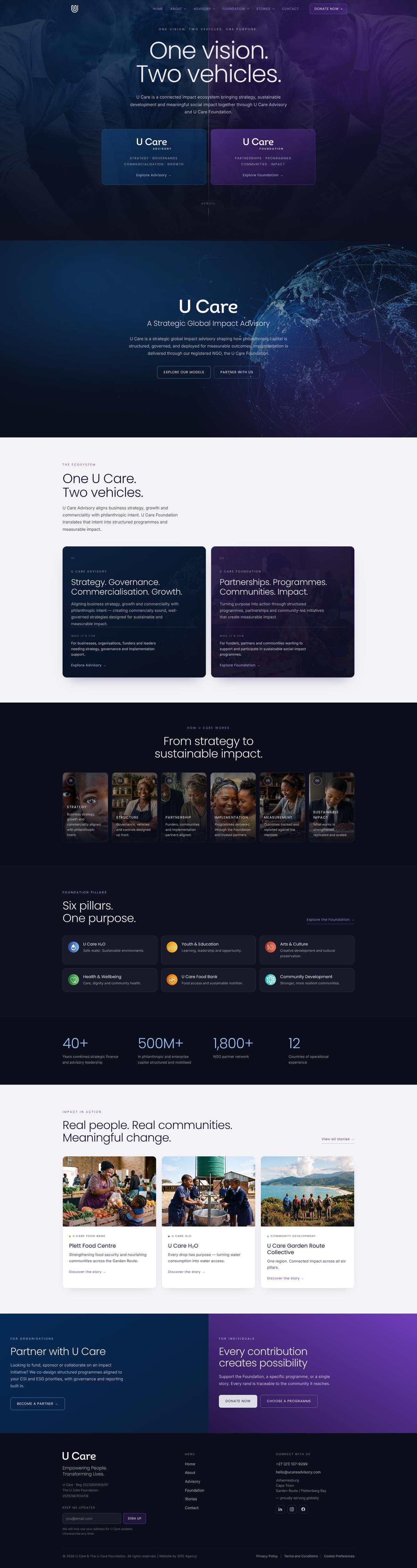

Four live pages, captured at 1600px and at 414pt and shown at their true proportions. Scroll either frame to read the whole page, switch between them above, or open any of them on the live site. The phone layouts are drawn for the small screen rather than reflowed from the desktop grid — the navigation, the statistics and the story chains are all different components, not the same ones stacked.
The campaign email
The campaign email, built to survive the clients we do not control.
The U Care Food Bank send: hand-coded, table-based, with every image inlined so it renders with images off and on a slow connection. On a phone the white card drops away and the design runs edge to edge. It is the same type, the same pillar colour and the same donation routing as the website — read it.


Delivered as a Mailchimp-ready template. Donation buttons carry the Food Bank's own payment code, so a click from this email is attributed to the Food Bank rather than to general funds.
The signature system
The rule holds even at the foot of an email.
Six signatures, one build. Five sit in Advisory navy; the Head of Arts & Culture sits in Foundation purple, because she belongs to the Foundation and the rule applies to people as much as to pages. Here is one of each. Shipped with a browser-based generator so the next hire can produce their own without opening a design file.
Hosted as images on the client's own WordPress install, with a copy-and-paste install page per person and a setup guide for Gmail, Outlook and Apple Mail.
The social campaigns
Thirty-eight posts that were never designed one at a time.
Six carousels for LinkedIn and Instagram, all of them cut from the website's own grid, type and pillar colours. Square, because square is the format they were made in — step through them.
01 / 08
Six pillars
What we made
Everything between the brief and the launch.
Analytics, Google Consent Mode v2 and Search Console went live with the build. Traffic and enquiry figures are deliberately not shown here: the site is too new for a full reporting quarter to have closed.
IDÉE — psychology-led marketing